Block Extensions
There is no core API for block extensions. When we refer to block extensions here, we actually mean using the hooks provided in the block editor to add our own custom attributes and UI to existing blocks.
The Block Editor Handbook has a full list of the available block filters in the Block Editor Handbook.
Luckily we don't have to manually use all the filters every time anymore. The 10up/block-components package comes with a registerBlockExtension API which allows you to get up and running much faster.
Why use Block Extensions?
The ability to extend blocks is one of the superpowers of the editor. Essentially the entire block supports system is built using block extensions. The concept is, that you can add custom attributes and editorial controls to one or more blocks at the same time.
But it isn't just useful when you want to add one control to multiple blocks. It also comes in handy as a replacement for block styles. As mentioned in that section the block styles api comes with big limitation that you cannot apply multiple styles at the same time and therefore cannot combine the effects they are having on the block. This is where being able to add your own settings to blocks comes in super handy.
Instead of having to add more and more block styles that essentially are just combination of other styles you can instead add these options as visual options that you can combine however you need.
Example
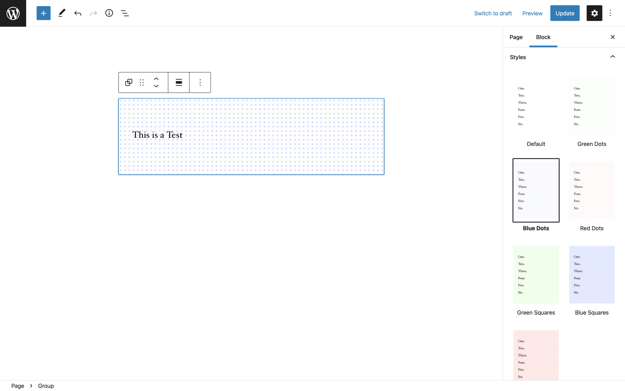
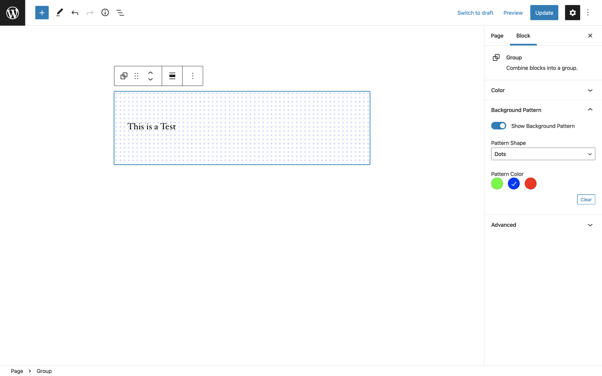
Let's say we have a design where we want to be able to have different background patterns on a group block. This pattern can start out as just three different block styles: dots, squares, and triangles.
Now the client comes and also wants the ability to choose between green, blue, and red variants of these patterns.
Because of the limitation of the block styles API you would now have to duplicate each of the variants twice to create a style for each of the combinations.
As a rule of thumb a block should never have more than 4 block styles.

This can be avoided by creating the same options as block extensions. Instead of nine almost identical block styles that take over the entire screen you can register two attributes: one for the pattern shape and one for the pattern color, and then add settings to the settings sidebar for them.

And if you need to extend this even further by adding a sizing control to the pattern or more different variants it is much easier than adding more and more block styles.
Using registerBlockExtension
The registerBlockExtension API makes it much easier to register these block extensions. Instead of having to manually hook into 4 different hooks you just need to call the registerBlockExtension function and pass it a few options
import { registerBlockExtension } from '@10up/block-components';

/**
 * BlockEdit
 *
 * a react component that will get mounted in the editor when the block
 * is selected. It is recommended to use Slots like `BlockControls` or
 * `InspectorControls` in here to put settings into the blocks
 * toolbar or sidebar.
 *
 * @param {object} props block props
 * @returns {JSX}
 */
function BlockEdit(props) {...}

/**
 * generateClassNames
 *
 * a function to generate the new className string that should
 * get added to the wrapping element of the block.
 *
 * @param {object} attributes block attributes
 * @returns {string}
 */
function generateClassNames(attributes) {...}

registerBlockExtension(
 'core/group',
 {
  extensionName: 'background-patterns',
  attributes: {
   hasBackgroundPattern: {
    type: 'boolean',
    default: false,
   },
   backgroundPatternShape: {
    type: 'string',
    default: 'dots',
   },
   backgroundPatternColor: {
    type: 'string',
    default: 'green'
   }
  },
  classNameGenerator: generateClassNames,
  Edit: BlockEdit,
 }
);
Options
| Name | Type | Description |
|---|---|---|
| blockName | string | Name of the block the options should get added to |
| options.extensionName | string | Unique Identifier of the option added |
| options.attributes | object | Block Attributes that should get added to the block |
| options.classNameGenerator | function | Funciton that gets passed the attributes of the block to generate a class name string |
| options.Edit | function | BlockEdit component like in registerBlockType only without the actual block. So onyl using slots like the InspectorControls is advised. |
Manually using the hooks
Common filters
blocks.registerBlockType
for adding new attributes / supports to a block.
import { addFilter } from '@wordpress/hooks';

add_filter( 'blocks.registerBlockType', 'namespace/filter-name', function(settings, name) {...} );
editor.BlockEdit
for adding custom controls to the blocks toolbar or settings sidebar.
import { addFilter } from '@wordpress/hooks';
import { createHigherOrderComponent } from '@wordpress/compose';

add_filter( 'editor.BlockEdit', 'namespace/filter-name', createHigherOrderComponent((BlockEdit) => {...}) );
editor.BlockListBlock
for adding additional properties to the wrapping element within the editor.
import { addFilter } from '@wordpress/hooks';
import { createHigherOrderComponent } from '@wordpress/compose';

add_filter( 'editor.BlockListBlock', 'namespace/filter-name', createHigherOrderComponent((BlockList) => {...}) );
blocks.getSaveContent.extraProps
for adding additional properties to the wrapping element in the save method.
import { addFilter } from '@wordpress/hooks';

add_filter( 'blocks.getSaveContent.extraProps', 'namespace/filter-name', function(props, block, attributes) {...} );